ALASKA AIRLINES - MOBILE APP
Reimagining the Flight Attendant Experience
End-to-end redesign focused on improving workflows by restructuring navigation and architecture. Optimized UI using iOS full native functionality and human centered design. The application gives Alaska, Horizon, and SkyWest flight attendants everything they need to provide a safe and superior guest experience.
The Process
I worked closely with product, engineering, stakeholders, and users to successfully redesign the app first introduced in 2016. I gathered powerful insights through workshops and user interviews, applied research, led cross functional design, and worked closely with the Enterprise Design Lab at Apple.
The Outcome
Prior to the redesign, our average CSAT score was 5.86. Following the release of the new version, we saw a significant improvement—CSAT increased to 7.3, and we introduced the System Usability Scale (SUS) for the first time, achieving a strong score of 81.6.
"It is so much easier to see the information at hand and do my job faster. If this is just phase one, I can't wait for the other phases to roll in. Thank you!"
Discovery & Research
Setting the Stage
This project that we began calling Block2Block 3.0, came from a large feature request (Onboard Ordering) from the business that would ultimately strain the original architecture design back in 2015.
There were known problems in the app, so we set out to find out:
1. Are there other problems I could address?
2. What was the scale of the problem?
Goals
I was hyper-aware of the change management needed for a successful launch of Block2Block 3.0. To mitigate this, I established a set of goals while working through the new design.
- Optimize app workflows to mirror the way they work onboard
- Give them prioritized information based on what they need when they need it
- Cut-down time spent on their devices to increase guest interaction
User Research
Block2Block is Alaska's most widely used employee-facing app and has the highest CSAT and SUS. The redesign aimed to maintain quality while improving the experience. Through many rounds of user testing and workshops, I began to understand flight attendant pain points and needs. Some common themes surfaced:
1. Users felt like they were taking longer to accomplish tasks due to the separation of interconnected features.
2. Current workflows don't match the service model as it has changed a lot over the years.
3. Information accessed differs significantly depending on the phase of flight.
Design Strategy
Applying the Research
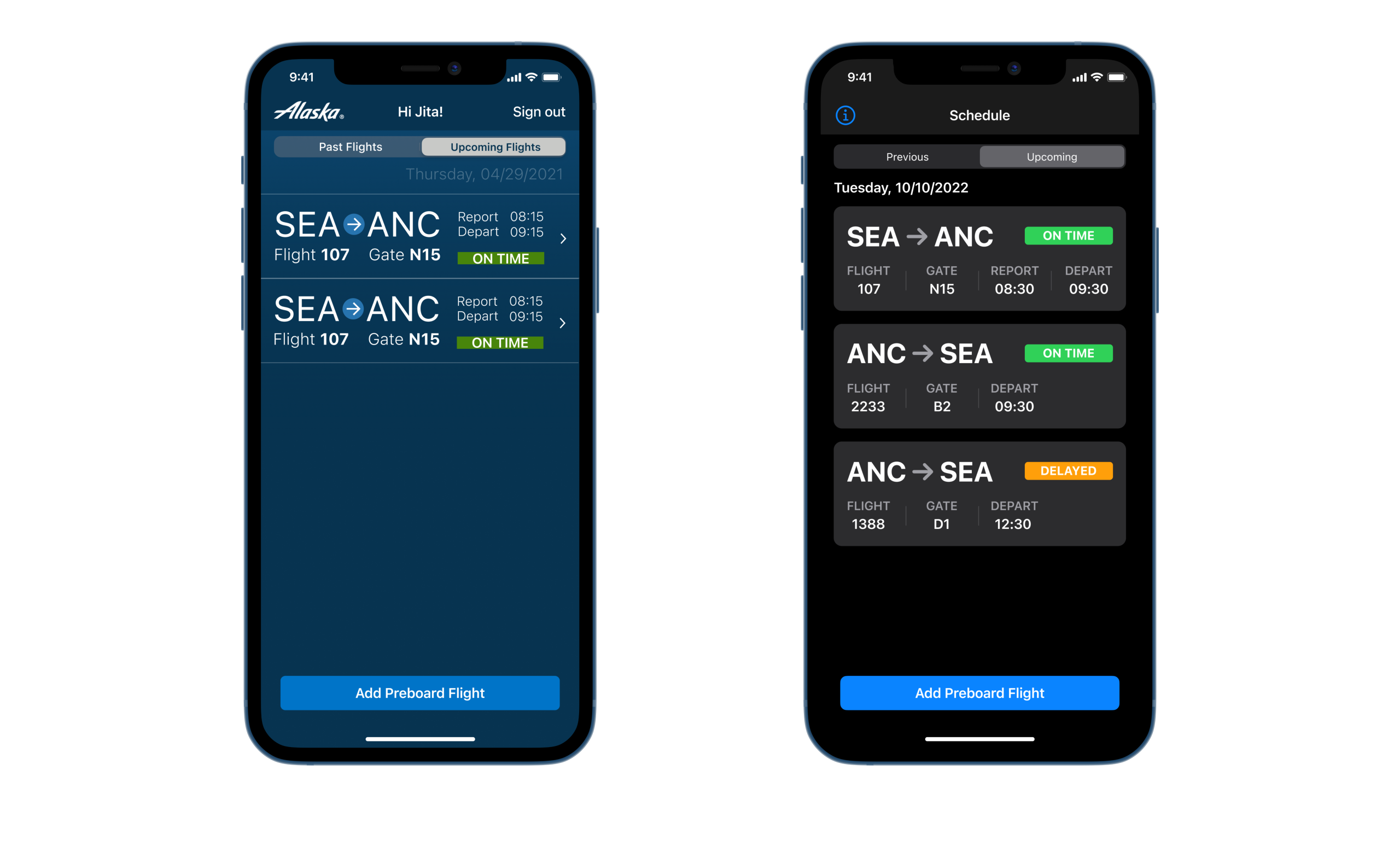
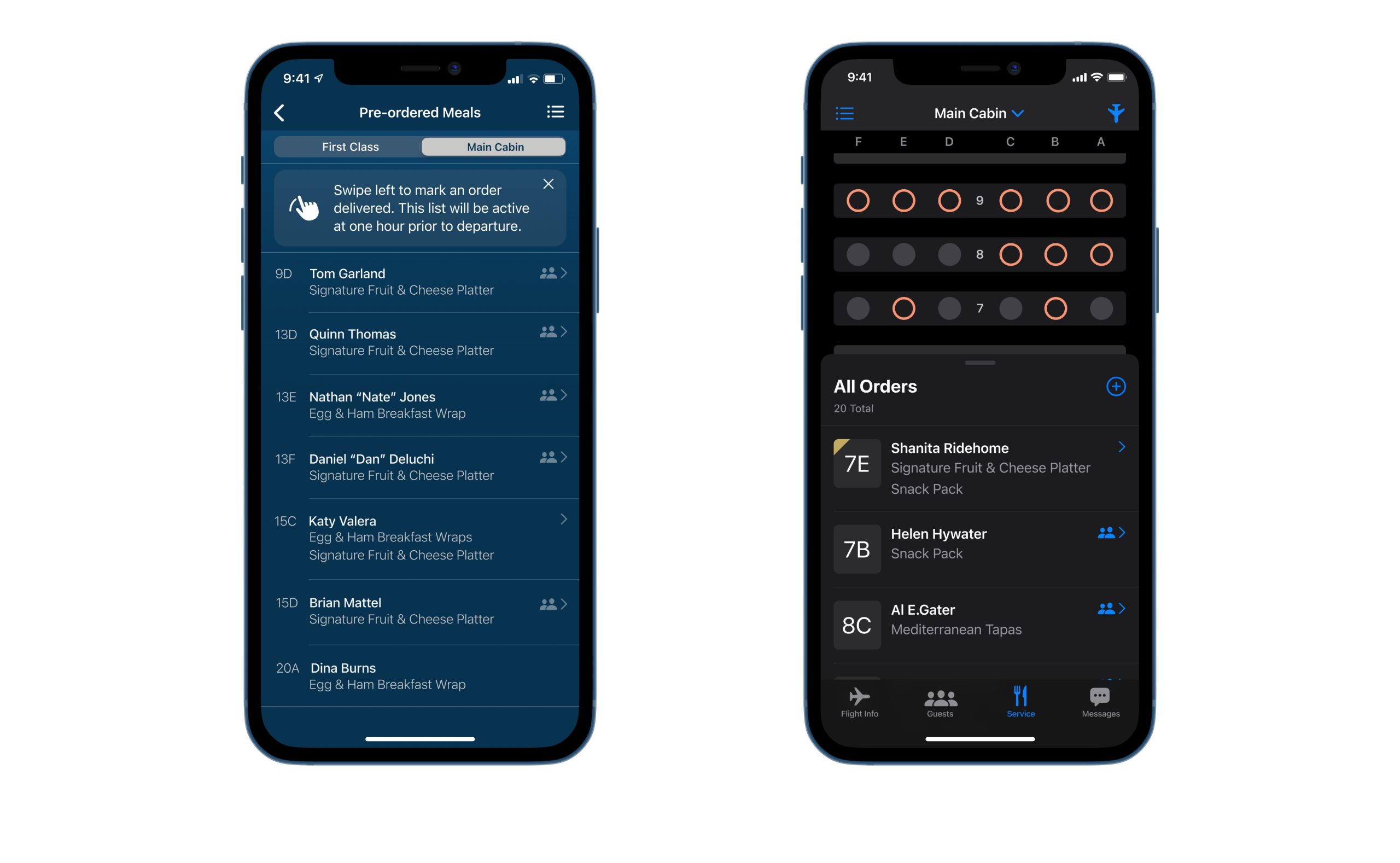
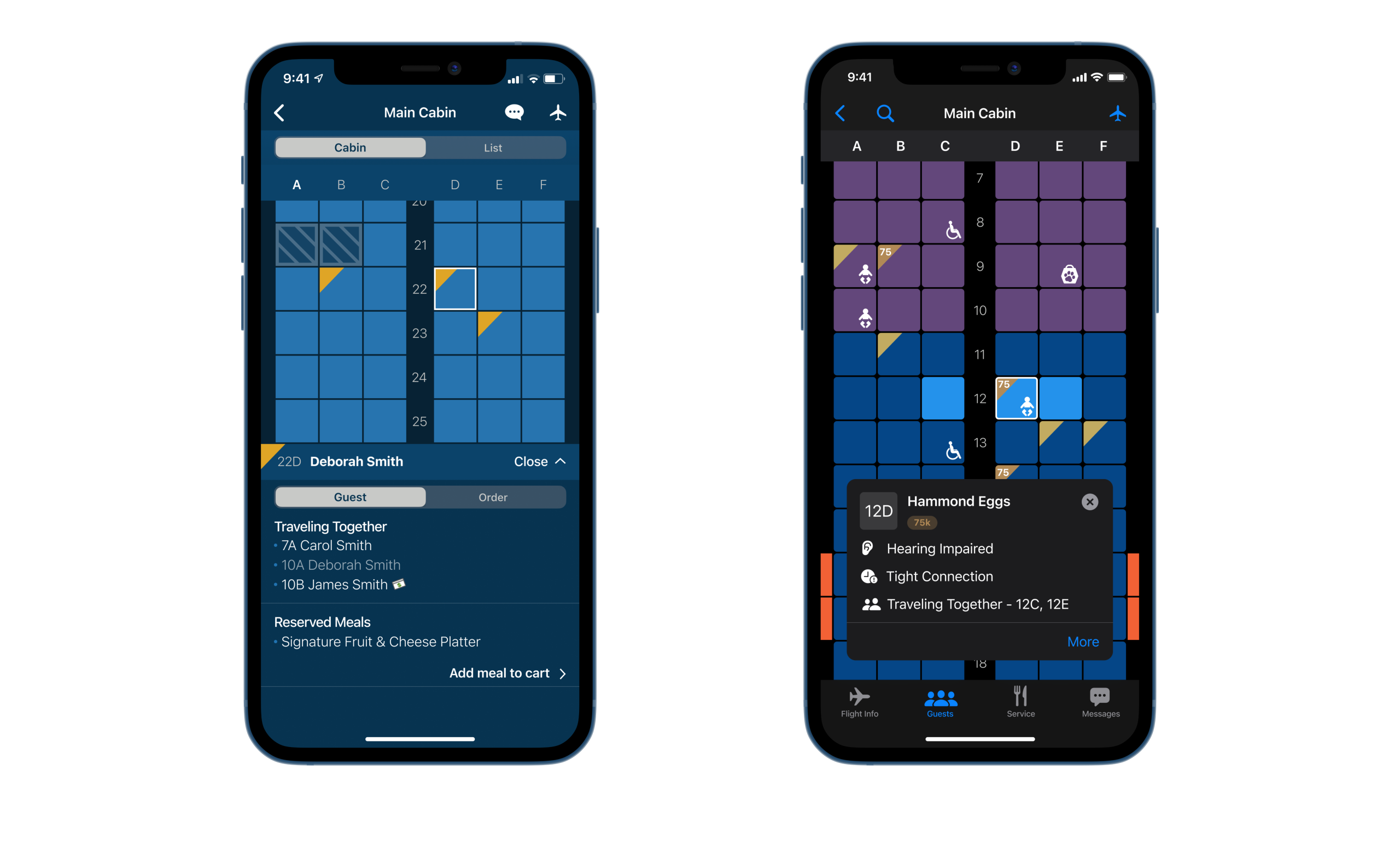
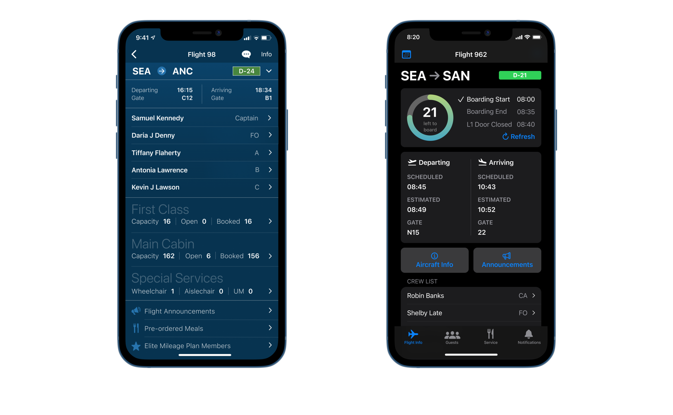
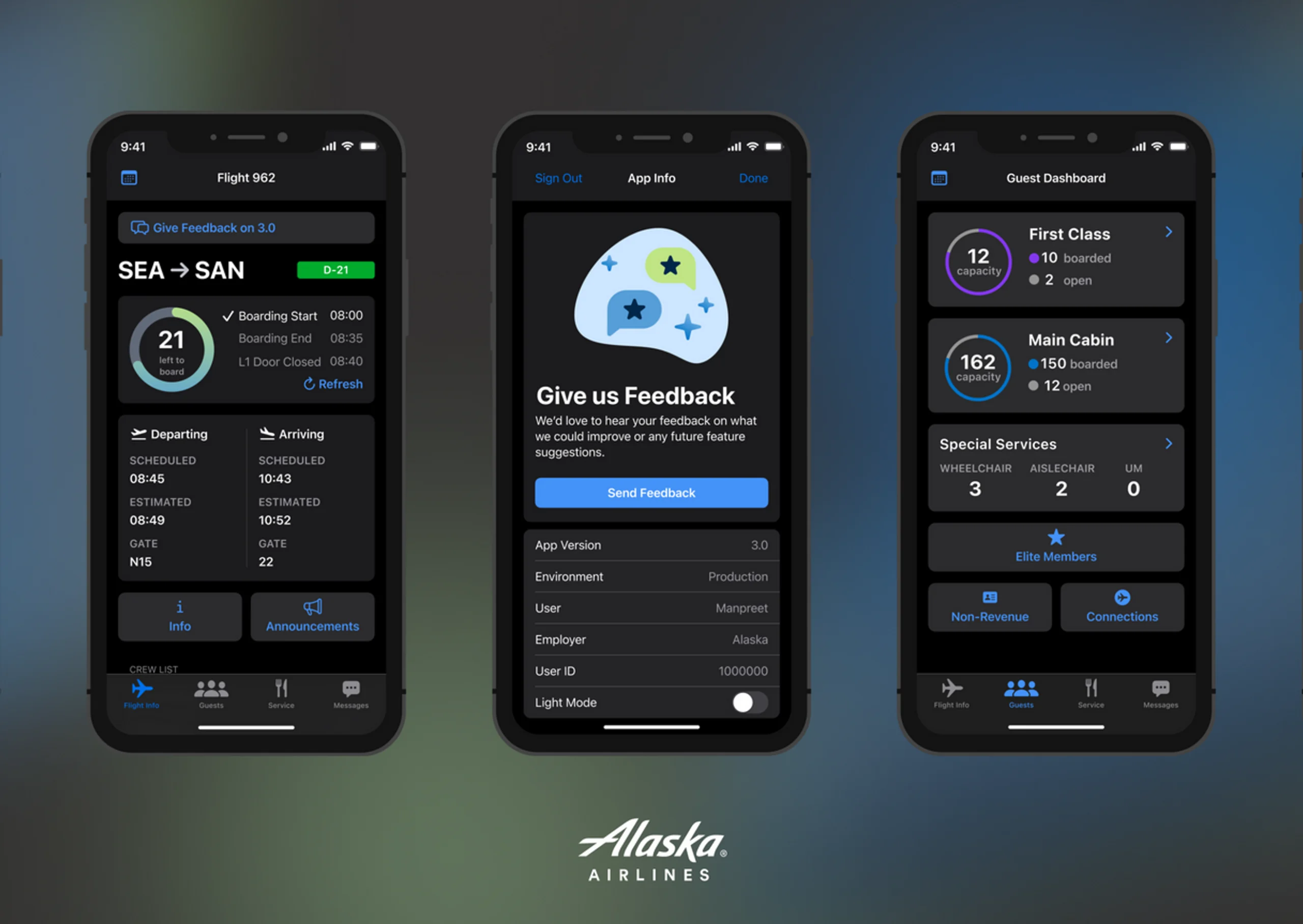
Our job was to give the Flight Attendants what they need, and what they need wasn't always what they explicitly told us. It was a lot of reading between the lines and designing experiences they didn't inherently know they needed. From the activities in the workshop, I determined a mental model that resonated with users based on the phase of flight. This new model consisted of 3 main buckets of information within the current app:
Flight Info - Accessed pre-flight leading up to boarding
Guest Info - Used heavily during boarding leading up to service
Service - Used for meal and drink service leading up to arrival
This new separation of features gave us a better understanding of the foundation to mold the workflows around. I created deliverables in order to frame the problem space and help us make informed decisions as the work progressed.
Refining Requirements
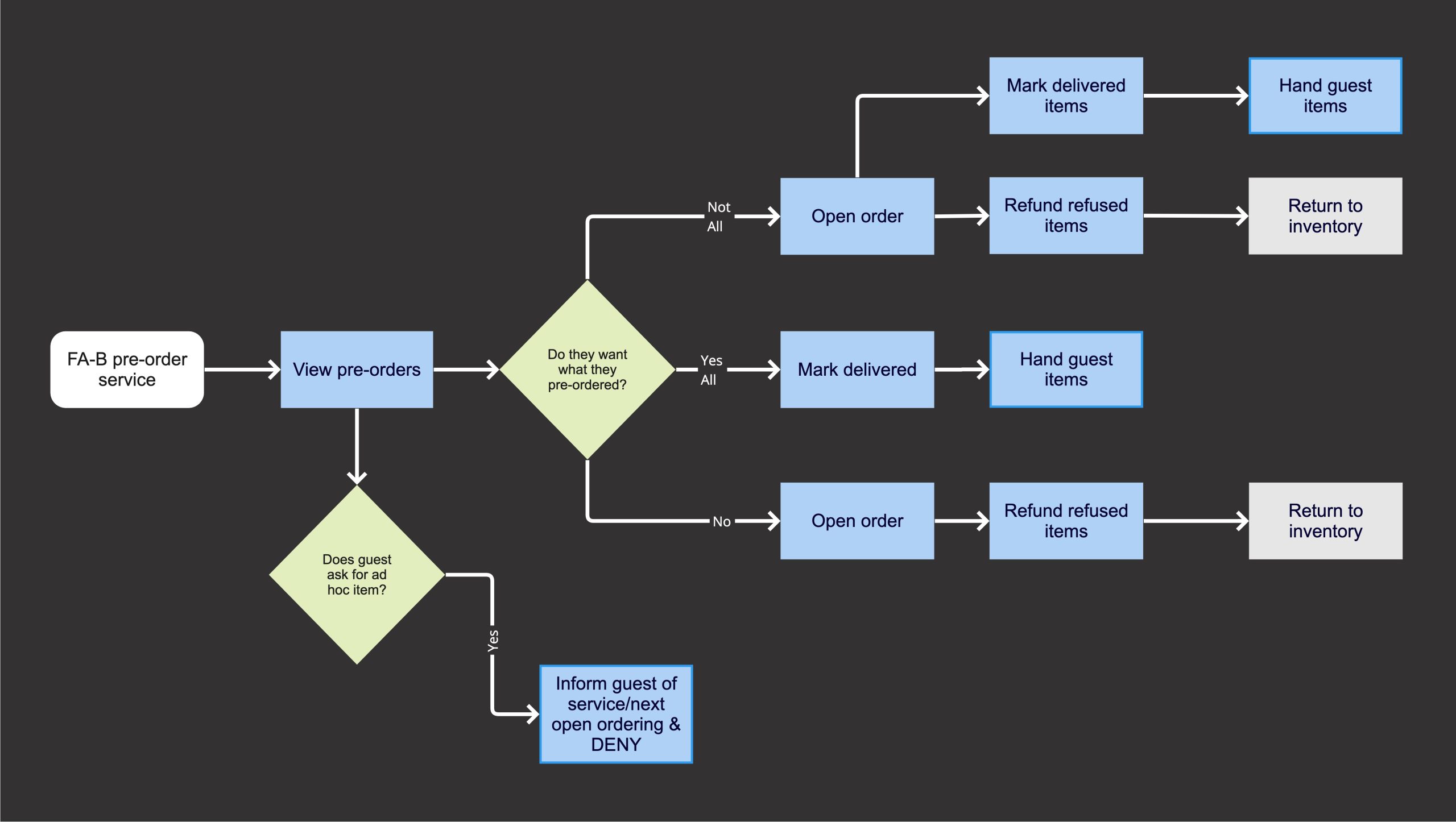
The app had 6 years worth of functionality packed into it's existing architecture that I was now untangling and piecing back together. I worked extensively with product and engineering in order to define and refine requirements as we were drafting the MVP. We focused on prioritizing bringing in the features that directly addressed the most significant pain points and provided the highest value to users and the business.
Design & Iteration
Initial Concepts
Once we were aligned on requirements, I designed a new tabbed navigation that complemented the phase of flight. This new navigation model optimized current workflows, improved efficiency, and ultimately allowed for increased guest interaction. In early explorations, I played with how the content might be interconnected, what features the users from our workshop said they use in conjunction, and what buried information I could give higher visibility. There were still a lot of questions and ambiguity as I workshopped different design concepts.
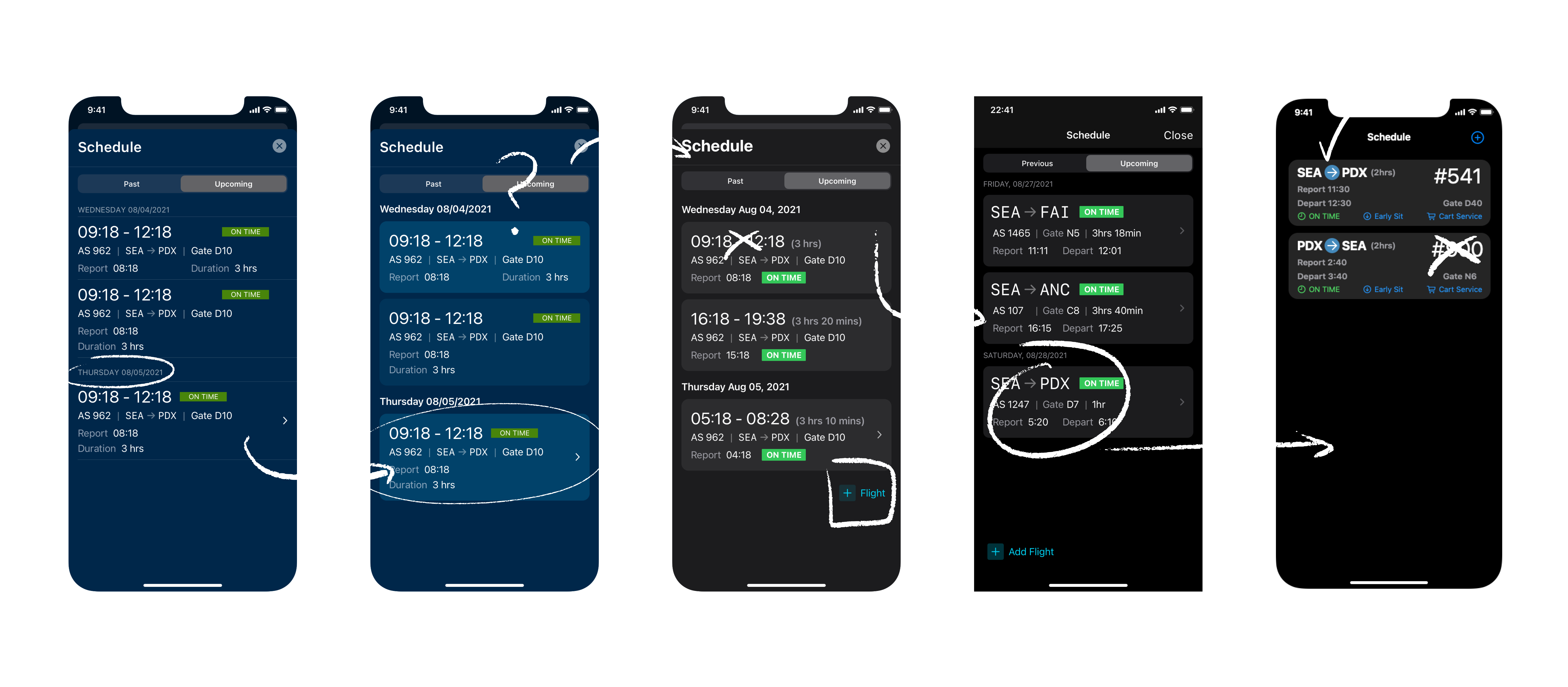
Revamping existing features required balancing the preservation of the original design intent with enhancing the user experience, which entailed many drafts and revisions. Through this process, I carefully assessed each screen's purpose and design to create a consistent and improved experience for our users.
Working with Apple
Throughout the redesign, I had to opportunity to work with the Enterprise Design Lab team at Apple who helped me brainstorm patterns and gave product optimization guidance. I leaned on them heavily during this phase to make sure we were making decisions that aligned with their human interface guidelines.
UI Work
After working through restructuring the navigation and hierarchy, I started to examine the UI elements I could improve. I prioritized using native iOS components and patterns for a couple of reasons:
- Flight Attendant familiarity with iOS products
- Streamlined development for engineers by using out-of-the-box components in Swift UI
- Drove the use of standardized components in our internal Design System for reuse
Improving Accessibility
By examining UI elements for improvement, I was able to also improve accessibility of the colors and text used throughout Block2Block. Flight Attendant demographics trend older, with a lot of our users being over the age of 40. This necessitated dynamic type in the app that would scale with the device settings to ultimately improve accessibility for our users. This was a priority for me as the app contains a lot of text heavy and data dense screens.
With the old design being based around the color blue, we were not meeting WCAG contrast ratio requirements with a lot of text buttons and interactions that were also blue. By implementing dark mode, I ensured we are giving maximum contrast while also preventing eye strain in a dark cabin.
Testing & Validation
Usability Testing
Once I had iterated through different concepts and patterns, I was ready to take high fidelity prototypes to the general public of Flight Attendants for testing. Change management was always top of mind during this part in the process. Our users were attached to the UI they have known and loved for 6 years. Showing them new concepts required some delicacy, but the new concepts were ultimately successful.
" It is so intuitive that even though it looks different, it is not even going to take one flight for flight attendants to recognize what they are seeing."
- 30 year Flight Attendant & Inflight Trainer
Lessons Learned & Next Steps
Throughout the course of this project there were a lot of important takeaways. The first being that a major change like this is hard. It was hard for our engineering team, hard for our stakeholders, and most importantly, hard for our users. We learned that building trust helps immensely while navigating the change. Our reputation of a design centered and user driven product team opened the door for this redesign.
Looking ahead, I will conduct CSAT and SUS scoring after the initial release to compare results with the existing application. We have the opportunity to help drive innovation efforts across the portfolio based on these results.
The opportunity to fully redesign a product doesn't come around often. I am very proud of my work and thankful for my team as they trusted me throughout this process. Without this essential piece, none of it would have been possible!
Final UI - Side by Side Improvements