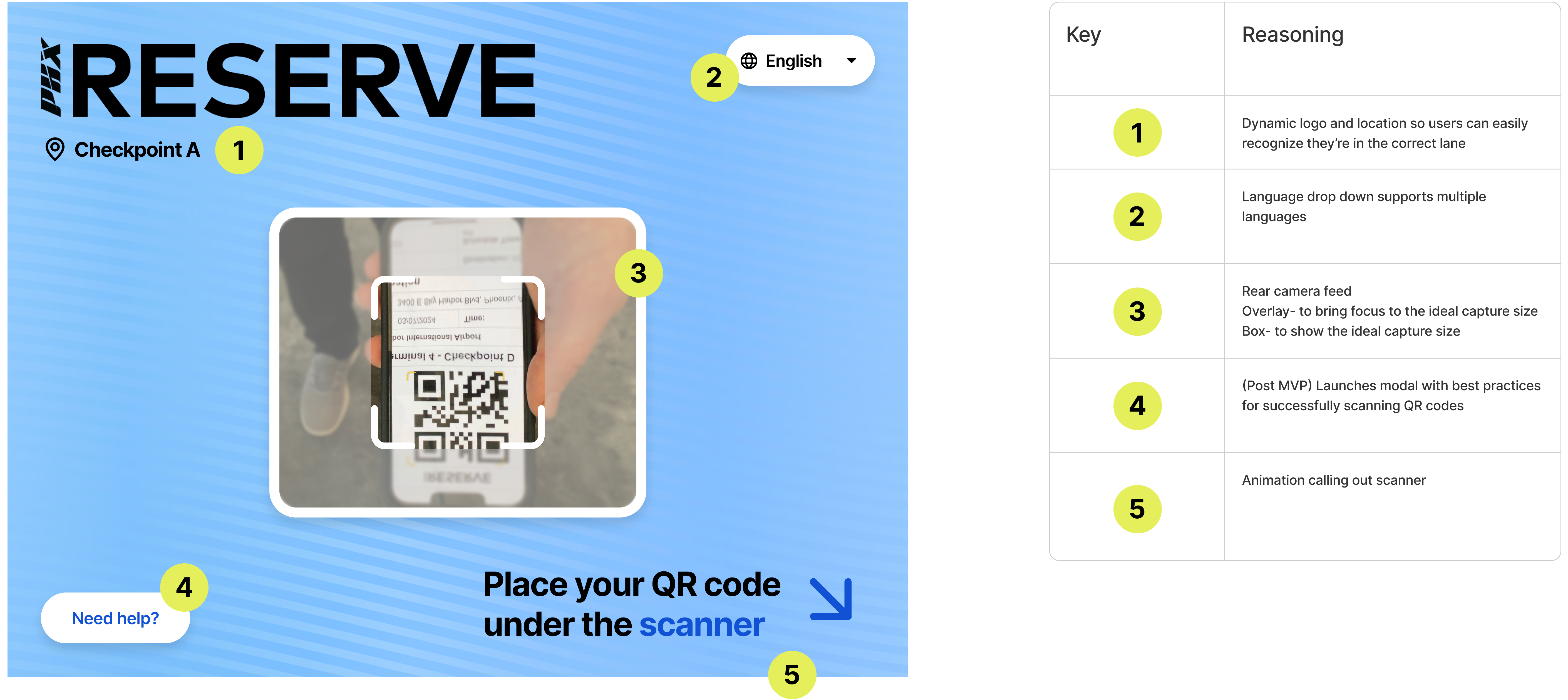
CLEAR - QR CODE SCANNER
Empowering Passenger Self Scan
A segment of CLEAR's business involves virtual queuing, mainly for international or smaller airports that don't qualify for a full CLEAR-managed solution but still need assistance with line management. The virtual queuing business model allows anyone, not just members, to purchase and reserve a spot in the security line.
The Problem
Staffing VQ lanes is costly for airports, making a digital self-service kiosk sound very appealing to our partners who are looking to renew their contract. I was tasked with designing a lightweight kiosk passengers could use to scan their QR code when they arrived at security. My goal was to design something that was highly intuitive and user-friendly, enabling users to confidently operate the kiosk without assistance from airport staff.
The Outcome
----
Design Strategy
Cross Functional Alignment
Transitioning from an agent-guided to a self-service experience required alignment across the different folks in the VQ space. I led sessions to define high-level requirements and expectations, ensuring there were few surprises from stakeholders during the design process.
Hardware Considerations
Knowing this experience was going to be self-guided, we evaluated different hardware options that could accommodate our needs. Collaborating with our hardware designer, we were able to develop a lightweight, cost-effective kiosk our airport partners could configure and supply themselves. This setup provided a familiar kiosk experience while operating on an iPad, which met user expectations. We confirmed its effectiveness through several rounds of testing before final sign-off.
Design & Iteration
The Flow & UX
The success of this experience hinges on the clarity and effectiveness of the scan results. Mapping out all the possible scan results helped me begin to understand what needed to be communicated to the user. This also required some cross functional collaboration to detail each possible state a user could find themselves in and understand operationally what they needed to do to remedy the situation.
Our airport partners emphasized the need for a semi-supervised experience. Agents should be able to monitor scan results from a distance to detect any suspicious activity, while ensuring passenger privacy in the public airport setting.
Initial Concepts
Leveraging our hardware requirements, I conceptualized two versions for user testing. My top priority was to ensure that scanning a QR code using the UI and hardware was intuitive for most users.
Version 1: Using the front facing camera
Version 2: Using the LiliTab attachment
Usability Testing
Internal Testing
Version 1: Front facing
Pros: Larger field of view could help orient users towards the box,
Cons: Feels non-standard, passers by could see themselves in the feed, block their field of view with their hand
Version 2: LiliTab
Pros: Understand use of external attachment to scan, Camera pointed at feet, better camera quality
Cons: Mirrored feed can be disorienting
While they tested similarly, the LiliTab Attachment gave users a more expected experience. 6/8 of our participants were able to scan their QR code and place it successfully, signaling to us that this design would work well out in the field.
Visual Design & UI
Once we identified the direction for the scanner, I designed a branded yet minimal UI. Scan results were made visible from a distance for effective monitoring and passenger comprehension. Engaging animations and timers were integrated to support and enhance the user experience. My goal with the UI was to create an intuitive and expected system, balancing passenger clarity with operational efficiency.
Field Observation
PHX Launch
I had the opportunity to go out to PHX on the day of the launch for support and observation. Overall, passengers were able to place their QR correctly under the scanner and were very excited to be trying something new.
We had a total of 1225 reservations booked during the first week of the launch. We had 62 completed surveys submitted with a 95% satisfaction rate. 77% reported the self scan kiosk was easy to use while 11% did not think it was user friendly. We had 162 no scan surveys submitted with 20% reporting they had issues with the self scan kiosk and 25% stating they could not find the kiosk.
Results
Lessons Learned
This project was my favorite at CLEAR, as it empowered me to make user-centric decisions and shape the best possible experience. I learned the importance of extensive testing and, if time permitted, would have included external participants to better gauge real-world performance. I also gained insight into external conditions that can impact the user experience, which are often overlooked from behind a desk.
Next Steps
After my on-site observation, I brought valuable insights back to the team. I identified technical discrepancies for engineering to address and noted experience enhancements I could implement. One key improvement was adding active guidance on the scanner screen to indicate when the QR code was captured and a result was being processed.
I also reviewed all passenger communications to better prepare them for using the self-scanner. Additionally, I tailored our post-scan survey questions to continuously gather feedback as more people used the new system.